Hanko: One Red Mark on a Sheet of Ink
An AI built the course site for my students, and the first draft looked generic. So I wrote down how my pages should look and why. The result is a design language called Hanko, named after the Japanese seal. The name turned out to describe more than the design.


The first version of the website for my students worked, and it looked like a generic Claude page.
I am an engineering manager, not an engineering team. Over the years I have come to understand how software is developed, but in most of its disciplines I am no senior. I am no senior developer, no UX or UI designer and no architect. At work, that is what a team is for: we build software in a regulated field, and results there have to be validated by people who can judge them. My own projects are not regulated. I do not take them lightly, but I can validate what an AI builds for me only to a limited degree. For these projects I accept that, and an AI is enough.
One of these projects is my course. Once a year I teach business psychology at the Ludwigshafen University of Business and Society. In the vacation before a new cohort starts, when the family is in bed, I hold what I call my teaching retreat and go through the last cohort: what went well, and what may change. This year it ended with a wish that slides cannot fulfill. I wanted to ask a question, collect the answers of everyone in the room, and show the distribution once each person has given their own.
For most of my working life, an idea like that would have stayed an idea. I usually knew what I wanted, and I lacked the means to build it. This time I described it to an AI, and a few days later the site existed. Every page was well made, and I had decided none of it. Where I had said nothing, the AI had filled in its default.
Saying what I want
I had never written down how my things should look. There had been no reason to, since I could not build them anyway.
One of my guiding principles at work is "form follows function": a process does not exist for its own sake, it exists so that people can work. I started there and asked for every element what a student should do with it. A card with a shadow asks you to act. A flat surface is for reading.
Red got a rule of its own. There is one red, and it is not used for mistakes. "Not correct" appears in black, and nothing is struck through. I want students to answer before they are sure, and a page that marks wrong answers in red works against that.
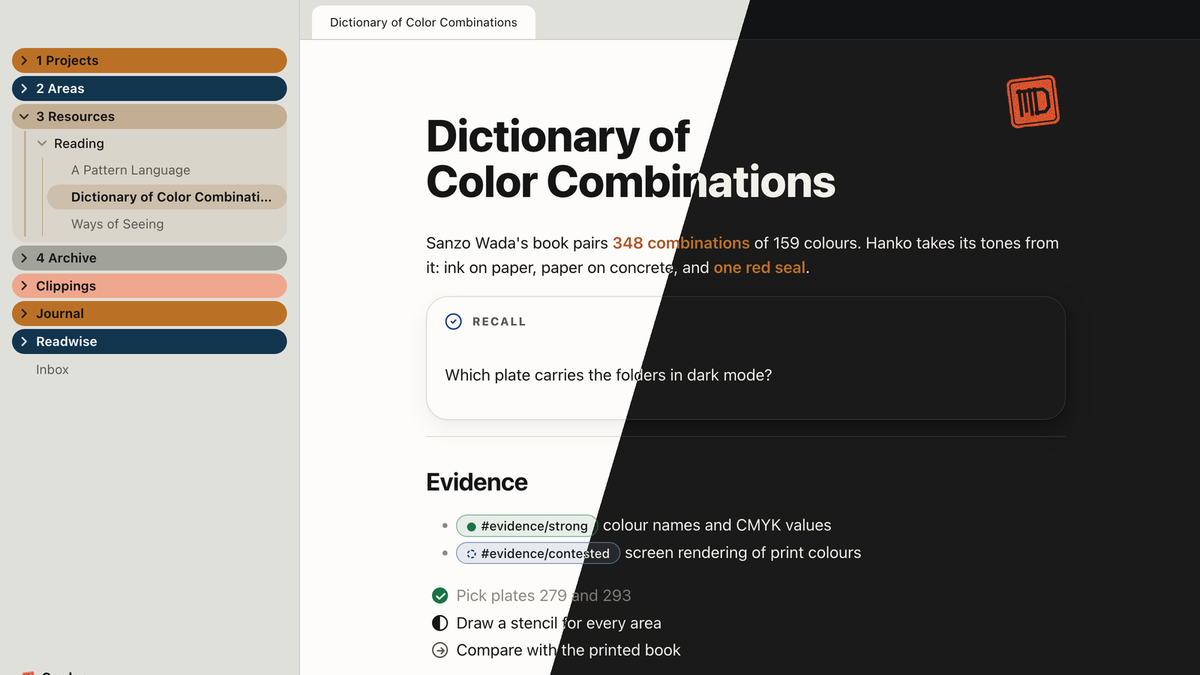
I did not pick the tones myself. I am red-green color-blind and not a designer. Some time ago I came across Sanzo Wada's A Dictionary of Color Combinations through a video I can recommend, and combinations that someone worked out long before me seemed a better basis than my own eye. For the same reason no meaning on my pages rests on color alone. There is always a shape and a word as well.
The step that helped me most was a table with two columns. For every influence I wrote down what I take from it and what I leave. From the to-do app Things I take the soft cards and the calm spacing, and I leave its blue. From Banksy I take paper and concrete as ground, black type, stencils and a single signal red, and I leave the motifs. From Apple's Liquid Glass I take translucent surfaces for controls that float above the content, and I leave glass on the content itself. The first column is a list of things I like. The design was decided in the second.
The name
I described the design first and then asked the AI to propose a name. One proposal was Hanko, the Japanese name seal: a single red imprint on a sheet written in black ink. Almost everything in the design is ink on paper, and one red mark shows where it matters. Many Japanese principles resonate with me, because I value the focus and the dedication in them. So the name was consistent for me.
While this post was being drafted, the AI pointed out something I had not seen. A hanko also does the work of a signature: the imprint on a document says that someone stands behind it. And that is the part I have kept for myself wherever I work with AI. My workflows stop at a point where I read what was produced before it goes anywhere. Every post on this site ends with the line that it was drafted with AI and that the thinking is mine. In the theme I built for my notes, the seal appears only on a note I sign off as finished.
I think the observation is right. Ink has become cheap. An AI writes pages, texts and code in any amount I ask for, and the generic first draft showed me what that amount is worth when nothing in it is decided. What I add is small by comparison: what the thing is for, what I leave out, and the mark at the end that says I stand behind it.
Where Hanko is in use
Hanko is now a folder in my notes with the stance, the influences, the principles and the colors with their jobs. For a new piece of work one sentence is enough: design it according to Hanko.
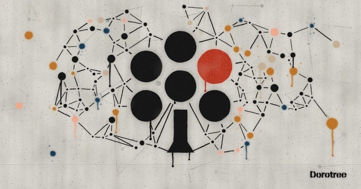
The course site was the first place. The second is this site, which has a new logo, a tree of six dots in ink with a red imprint.
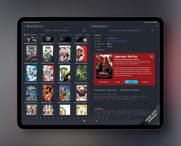
The third is Obsidian, the app I keep my notes in. Hanko is available there as a community theme, and the code is on GitHub.
Before the first session
My students have not seen the course site yet. The first reviewers were my family, and my wife said she would like to sit in the lecture herself. I have tested the pages on my phone and on my iPad. The iPad is still one of my favorite devices, even though an AI is hard to operate well on it so far. A shout-out here to Minis, an app that makes the interfaces of iOS accessible to an AI in a smart way: it has become my barista, and it manages our family calendar.


In the surveys, the cohorts so far have been very satisfied with the course. I hope the site helps me teach it better still, and I will know more after this one.
I learn in this course as well as the students. This year I learned that as long as I could not build such things, I never had to say exactly what I wanted. Now an AI builds them, and my part is to say it and to put my mark under the result.
Sources and further reading
- Doroszewski, M. (2026, September 20). The gate is for the context – Why I still read what my AI writes. Dorotree. https://www.dorotree.me/the-gate-is-for-the-context/
- Doroszewski, M. (2026). Hanko [Obsidian theme]. Obsidian Community. https://community.obsidian.md/themes/hanko (code: https://github.com/mdoroszewski/obsidian-hanko)
- Wada, S. (2010). A dictionary of color combinations. Seigensha.
- bungu. (n.d.). The man behind the viral color dictionary [Video]. YouTube. https://www.youtube.com/watch?v=Pp3IPMLAf7Q
- Open Minis [Mobile app]. App Store. https://apps.apple.com/app/open-minis/id6759188481
Drafted with AI — the thinking is mine.